Enterprise Knowledge (EK) is a consulting firm specializing in knowledge management, data, and AI solutions. I was brought in to address their challenge of brand differentiation caused by relying on generic design resources, such as Noun Project, that competitors also used. My goal was to lead the effort to develop a unique, consistent visual brand and to create a custom icon library that could be easily integrated and maintained by the EK team and future designers.
Visual Designer
UI Designer
Figma
Photoshop
Illustrator
Icons
Illustrations
Infographics
Mockups
Prototypes
High internal adoption of Noun Project for presentations and social media necessitated creating a new, branded resource that was equally simple and accessible for daily team use.
Noun Project serves well for ad-hoc design, but the decentralized selection of icons by various team members naturally resulted in an inconsistent visual style across brand assets.
Examples of Noun Project Icons
The initial versions of the branded icons were created for a blog, incorporating triangular elements from the company's logo. While the results were visually successful, the style proved challenging to produce under tighter time constraints and would have been difficult for future designers to replicate consistently.


First Icon Concepts
The next set of iterations remained geometric but incorporated a wider variety of shapes and lines. This decision established the necessary flexibility for experimentation, which was critical for creating icons that accurately and effectively visualized EK's complex service offerings.


2nd Generation Icons
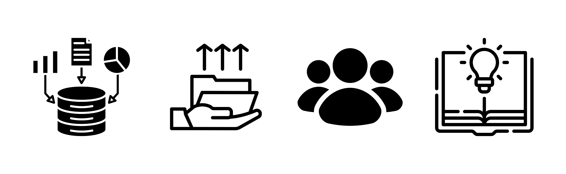
Following each deployment, the new icons were systematically collected and stored within the central library I was developing. These assets became essential across the firm, utilized for presentations, blogs, websites, and digital marketing materials.
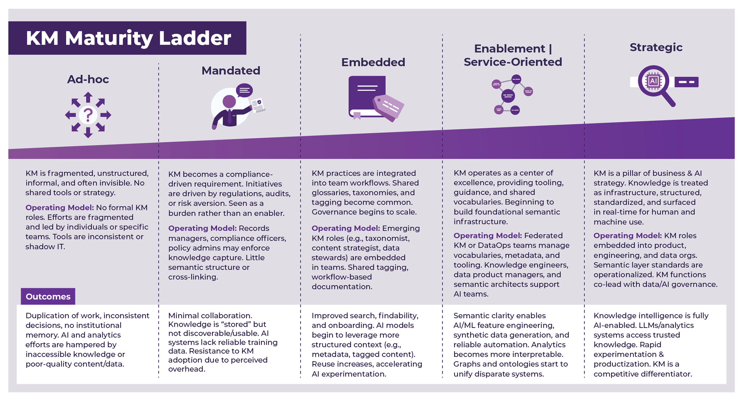
Infographic Including Icons

Infographic Including Icons
With the consistent icon style established, the visual branding was extended to larger illustrations and diagrams. These visuals were integrated across EK's website and blogs, improving brand consistency across all digital marketing materials and online platforms.

Blog Illustration
In preparation for the launch of new services, I collaborated with the team to restructure aspects of the website. Key goals included reducing content density and ensuring service descriptions were more concise. This resulted in a standardized wireframe, shown here, which established consistency across all service page layouts.
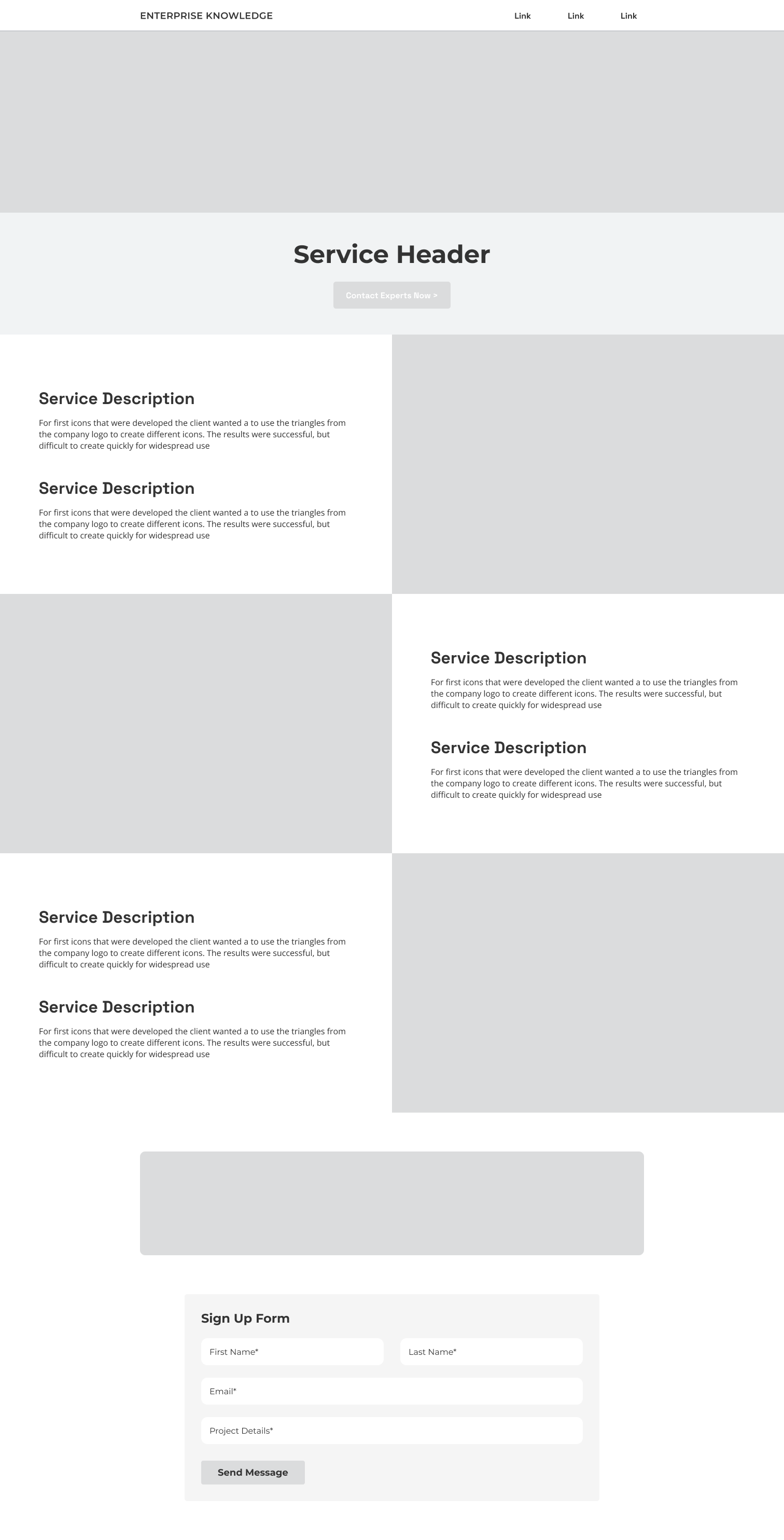
Wireframes
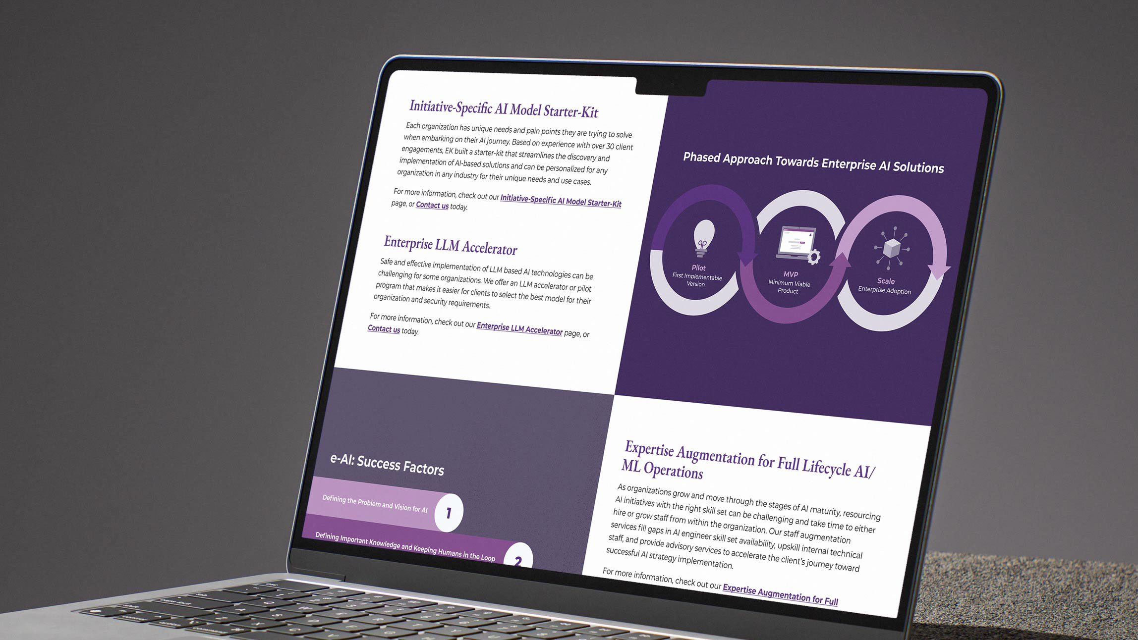
Collaborating closely with Subject Matter Experts (SMEs), I designed diagrams and infographics to clearly explain EK's services and their associated benefits. The final mockups were developed using a combination of custom illustration and photography and were prepared for review and final implementation.
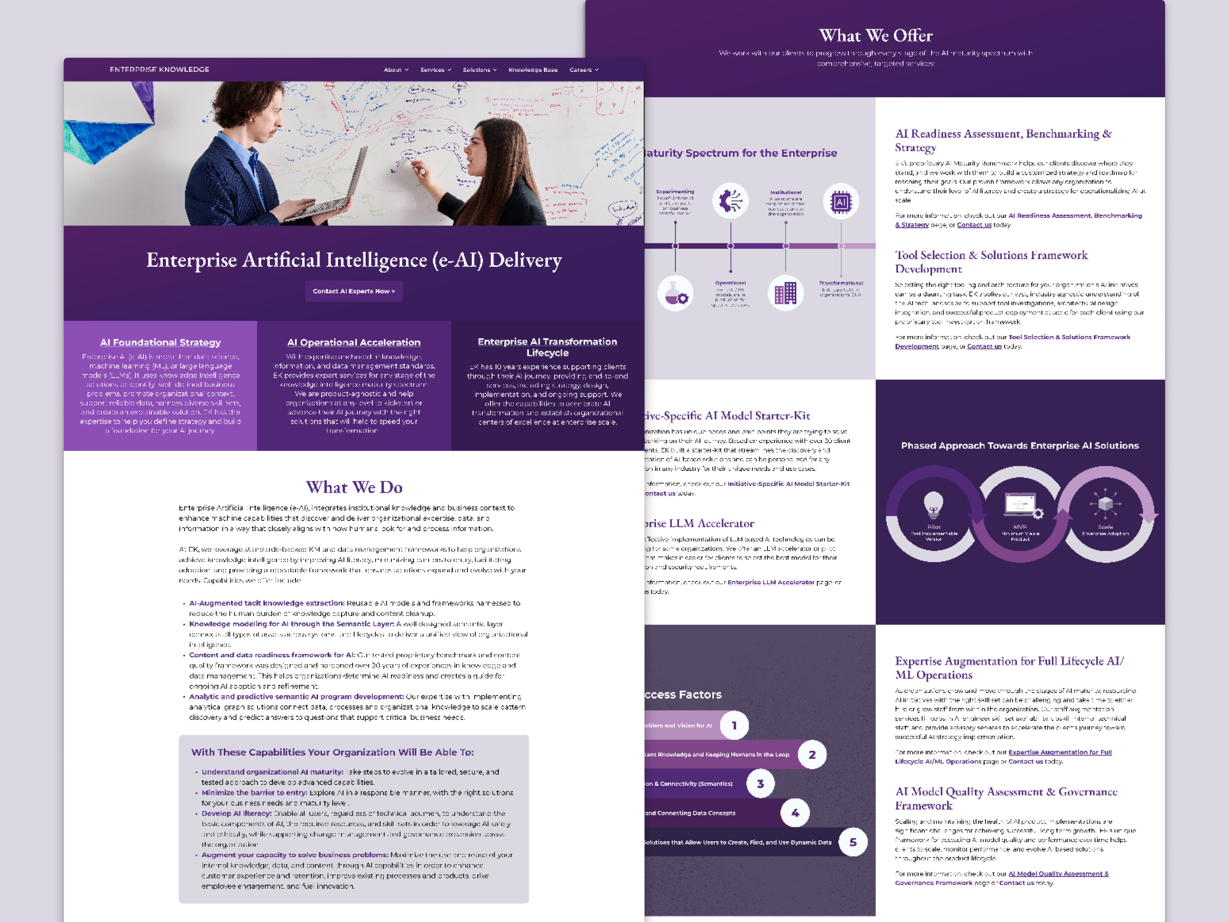
EK Website Mockup
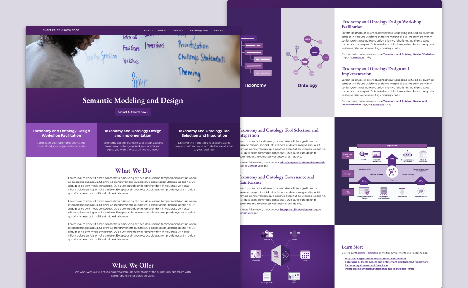
EK Website Mockup
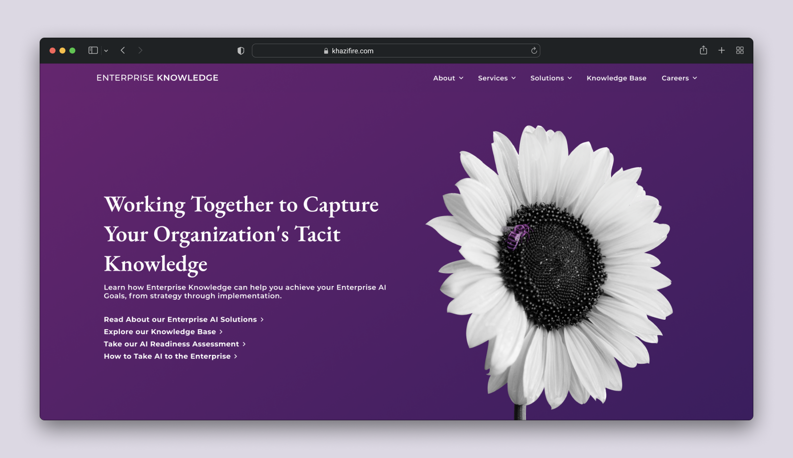
EK Hero Mockup
Premade design resources, while initially helpful, can eventually hinder a business's ability to stand out and establish a strong visual identity. Through my work with Enterprise Knowledge, successfully developed a unique visual style and a custom icon library that aligns with their brand. This library is not only used across platforms to ensure consistency, but it is also designed to be accessible for all team members and sustainable for future designers to maintain and evolve.
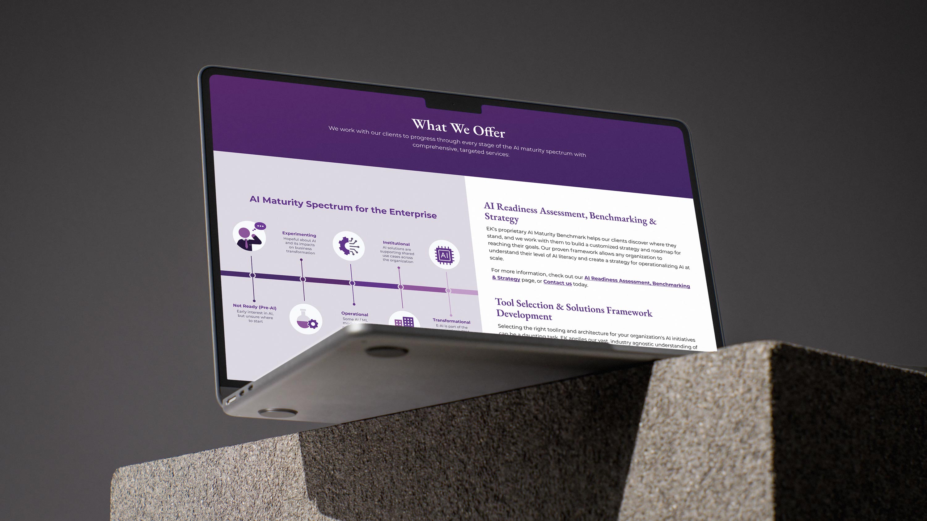
EK Website Final Mockup
