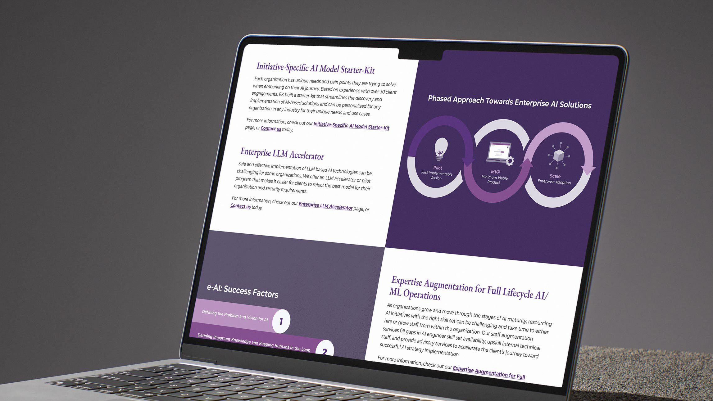
Enterprise Knowledge (EK) is a consulting firm specializing in knowledge management, data, and AI solutions. I was brought in to address their challenge of brand differentiation caused by relying on generic design resources, such as Noun Project, that competitors also used. My goal was to lead the effort to develop a unique, consistent visual brand and to create a custom icon library that could be easily integrated and maintained by the EK team and future designers.
Visual Designer
UI Designer
Figma
Photoshop
Illustrator
Icons
Illustrations
Infographics
Mockups
Prototypes
Previously, EK relied on an open-sourced icon library, which served its purpose in the short term but eventually led to a fragmented and inconsistent visual presence that was sometimes mimicked by competitors. The challenge was to move beyond generic assets and establish a unique visual language capable of distilling complex concepts into intuitive visuals.
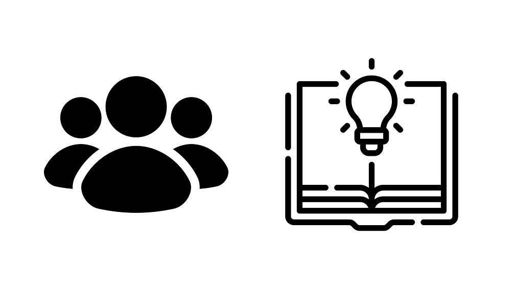
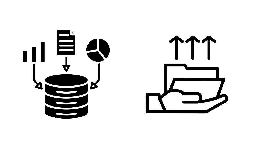
Our goal was to build a system that differentiated the firm while serving as a practical resource for internal teams. Moving away from early concepts based on the logos triangular aspects, we adopted a clean geometric foundation to prioritize ease of use and long-term scalability. This modular approach established a flexible visual language that can demonstrate complex concepts.
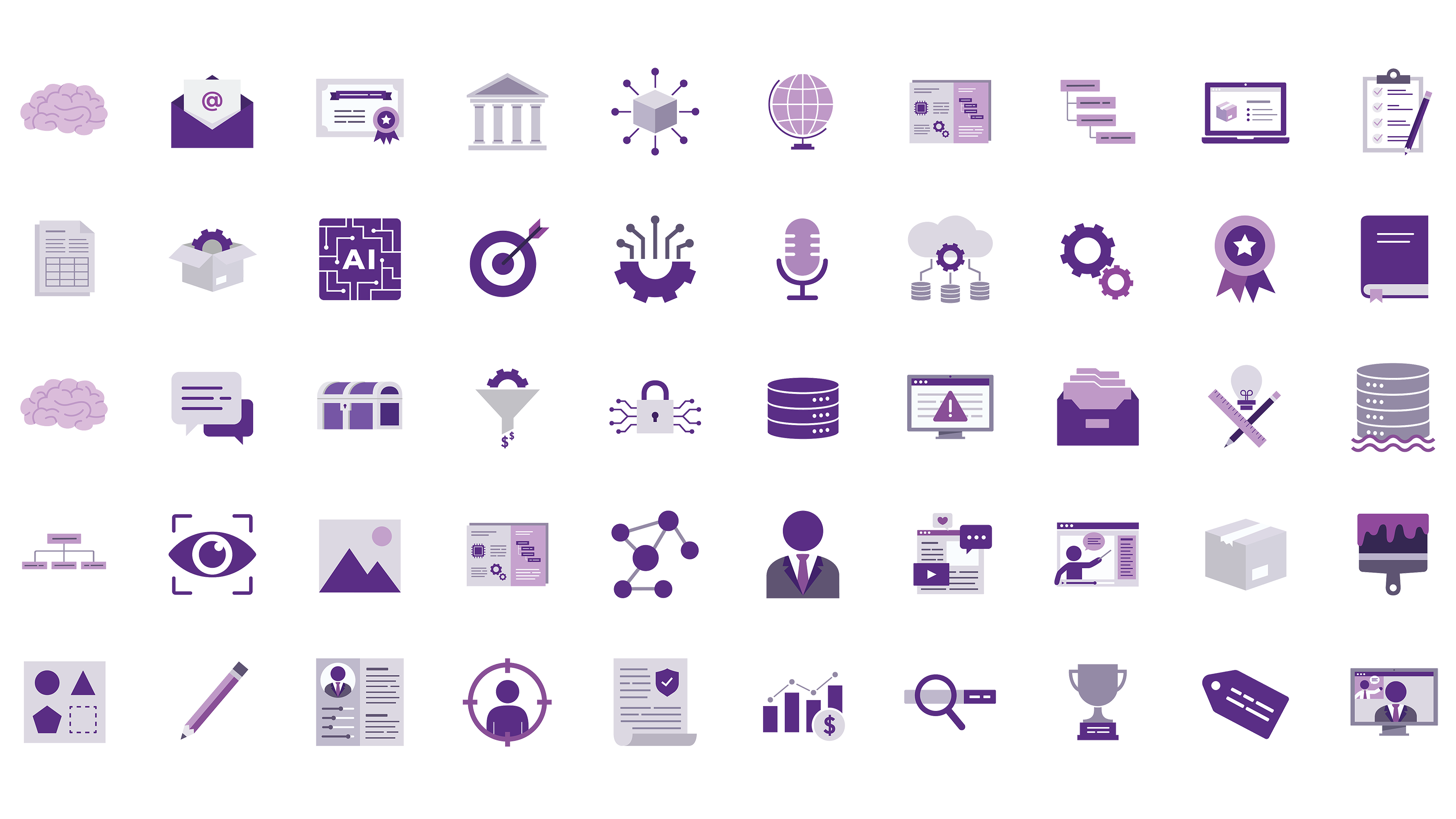
Set of EK Icons
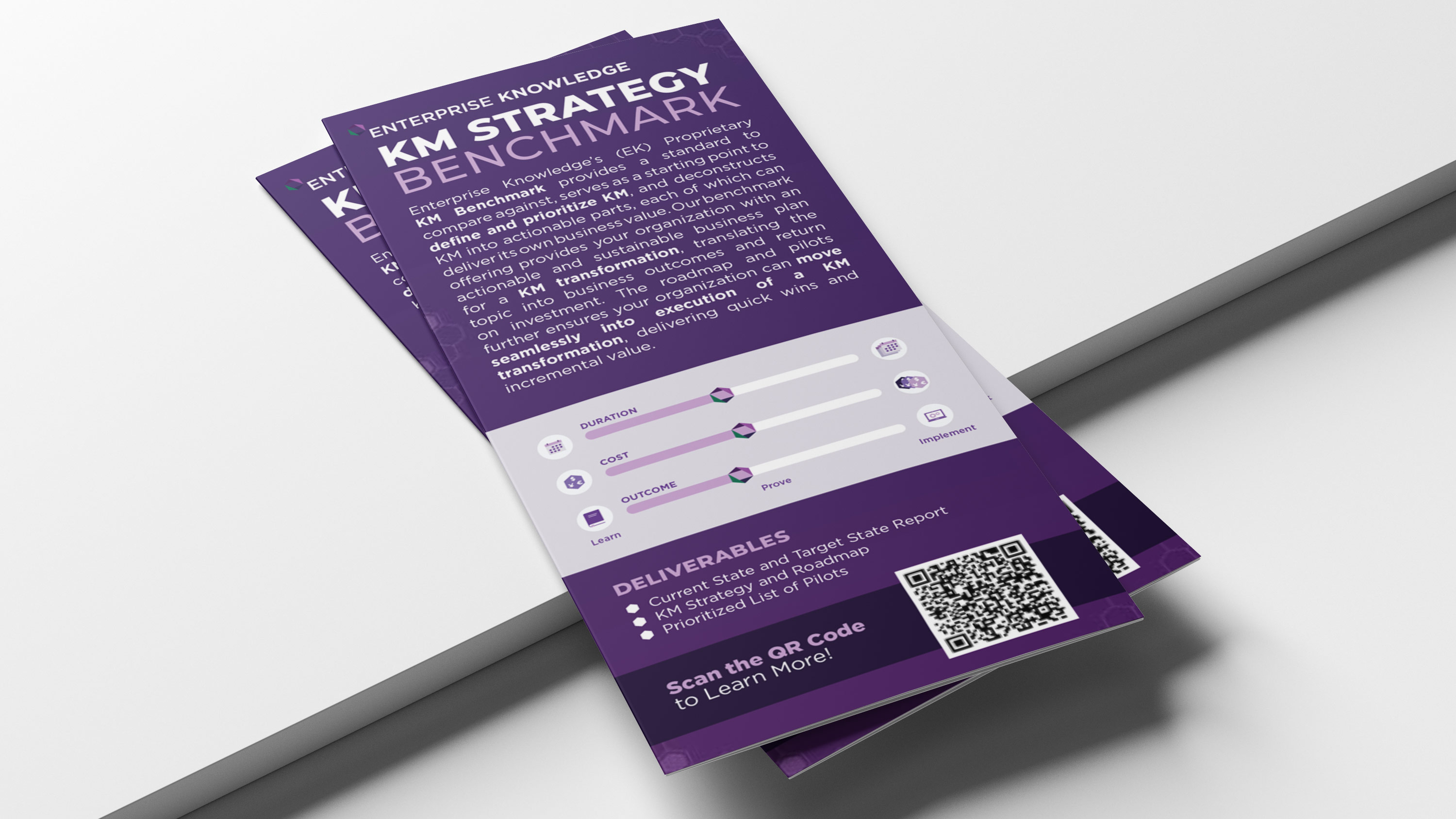
Once the visual style of the custom icon suite was established, I extended that same flat vector aesthetic across the company's broader visual touchpoints. Applying this consistent language to blog illustrations, infographics, and marketing collateral helped streamline internal content creation while building a cohesive, instantly recognizable brand presence across all media.
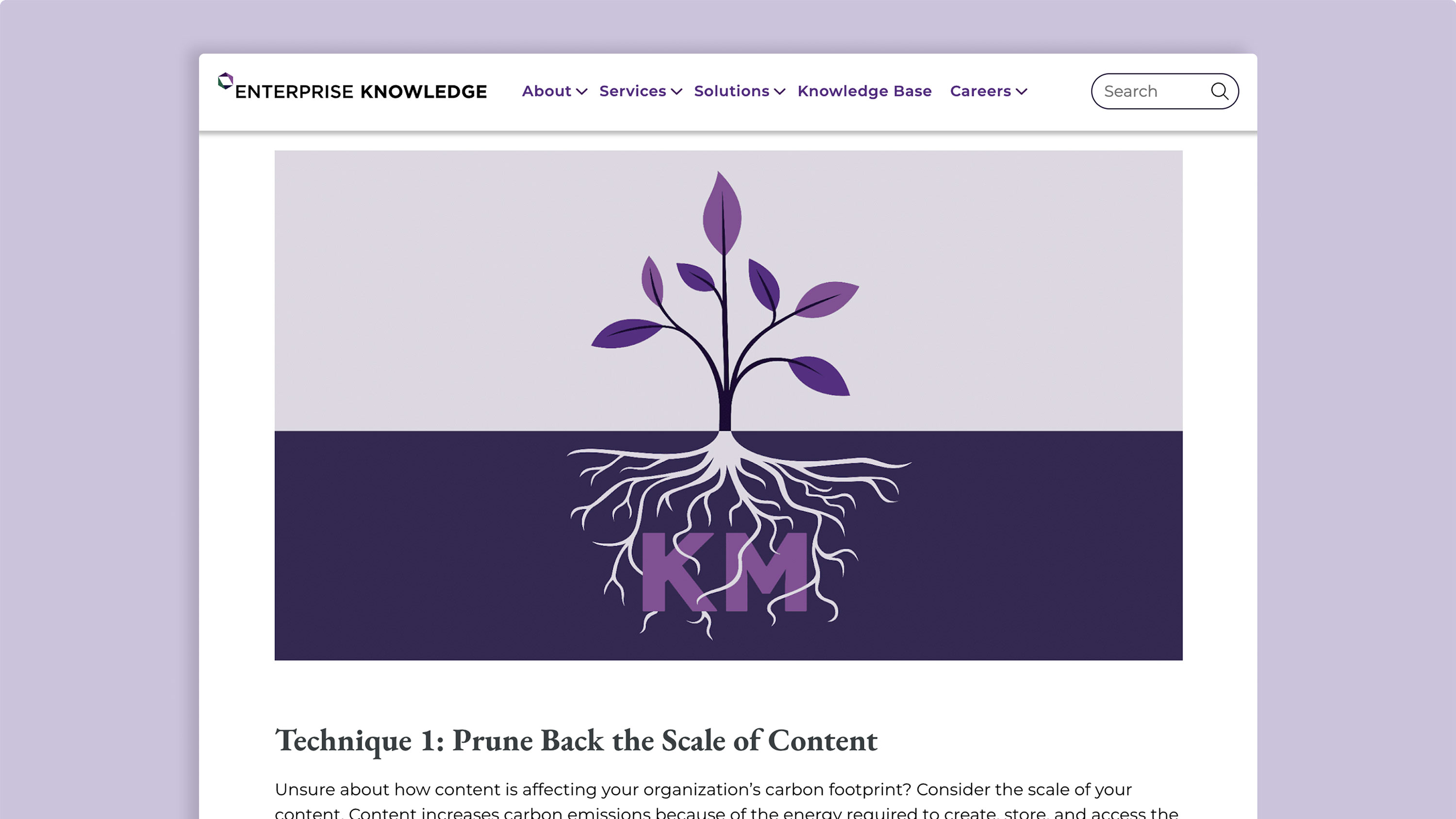


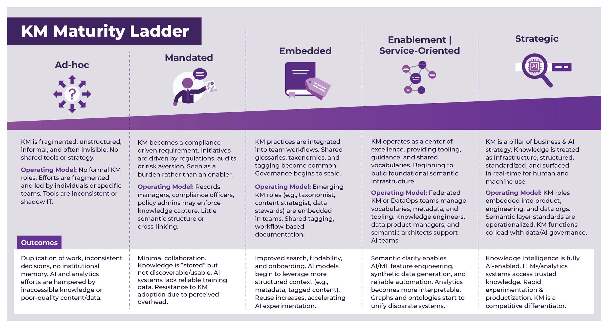
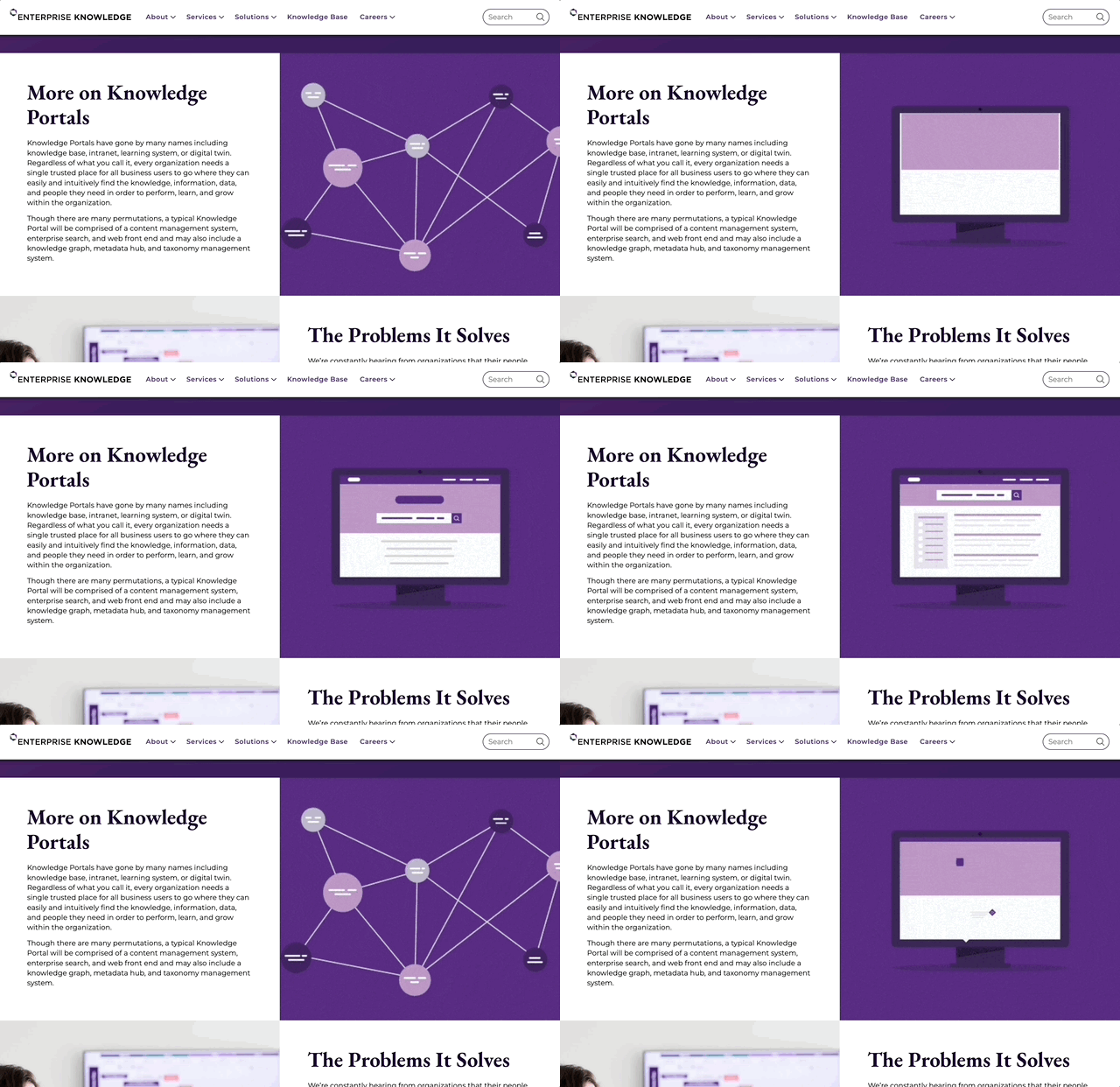
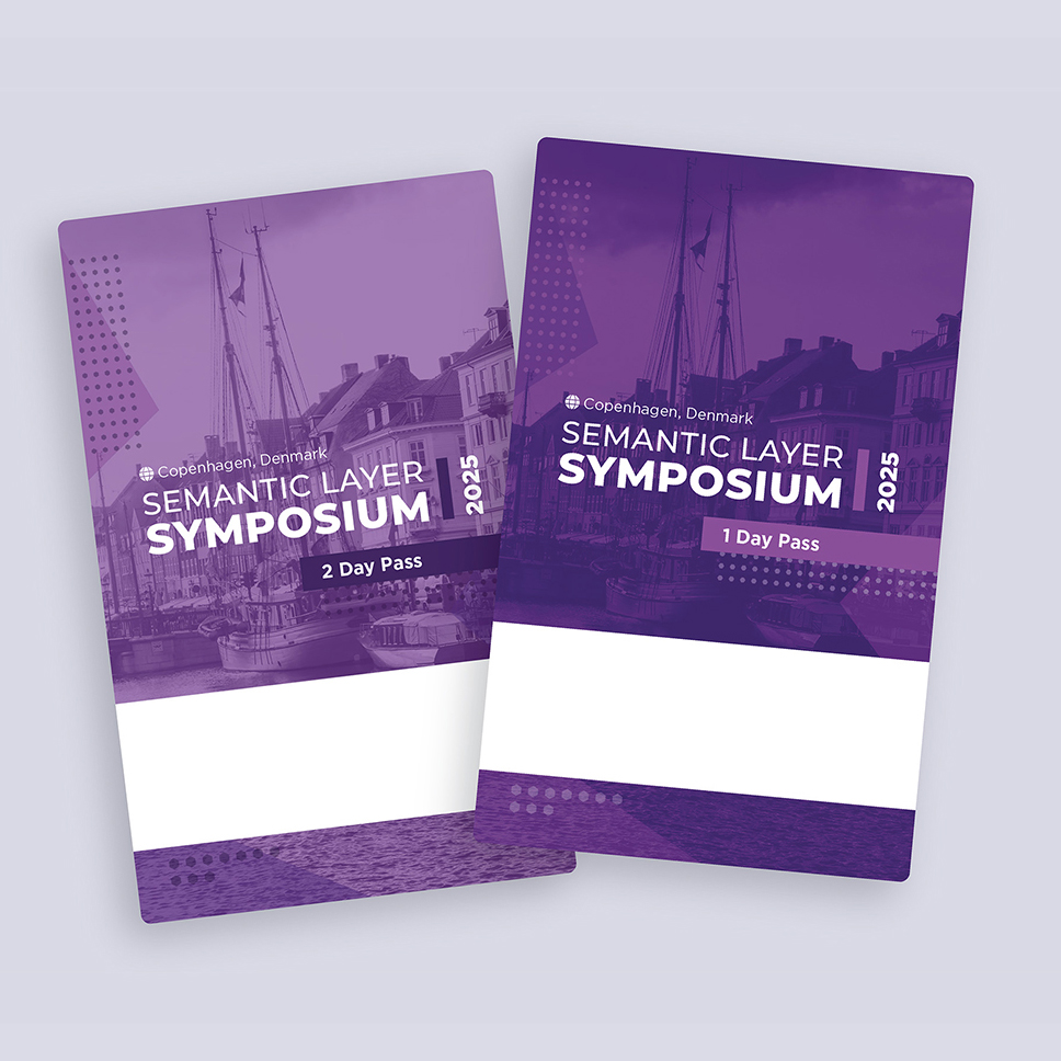
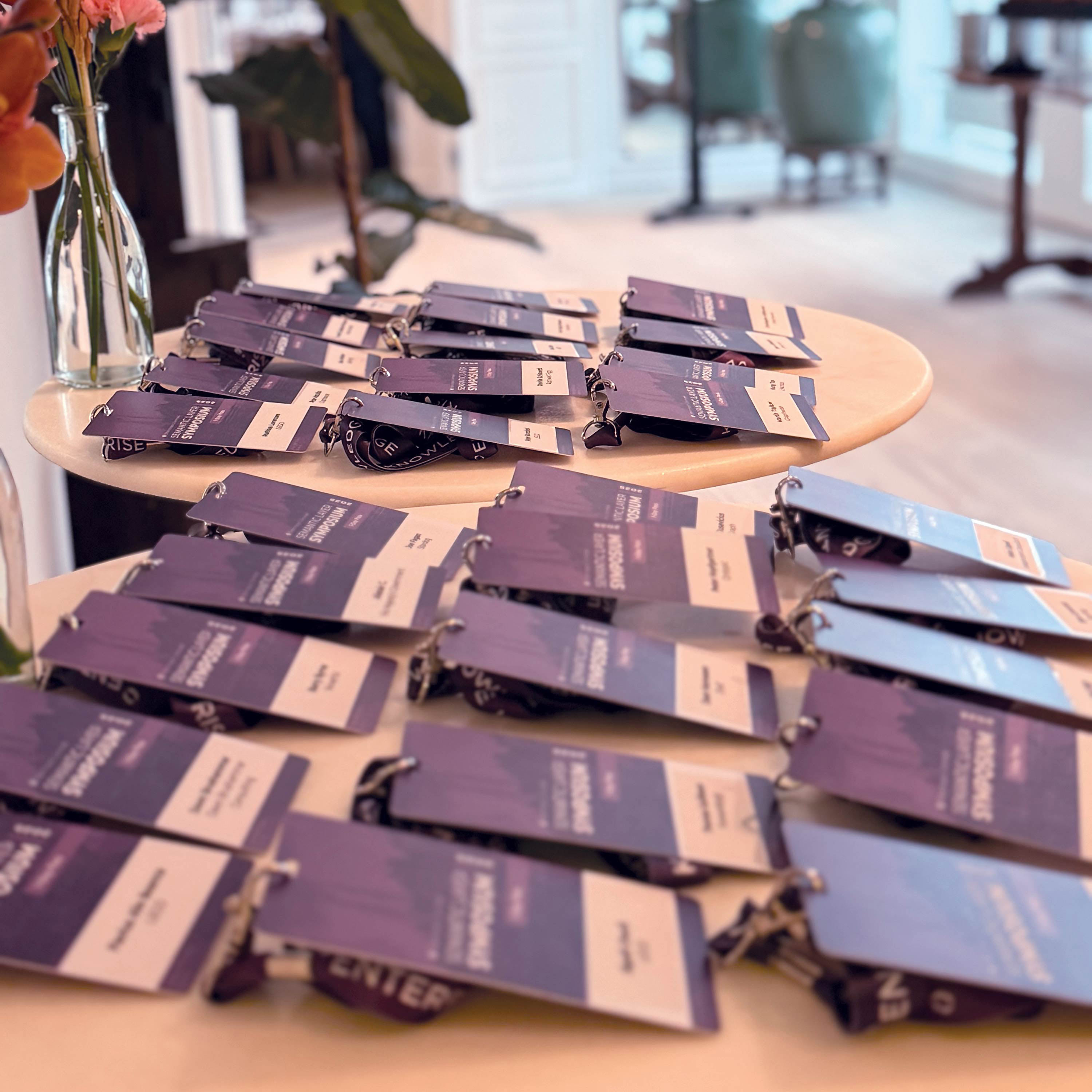
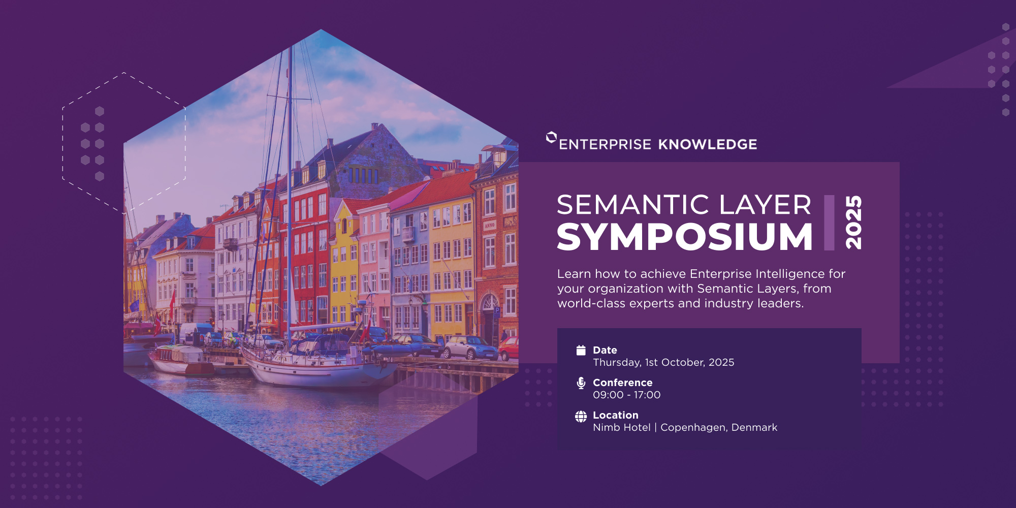
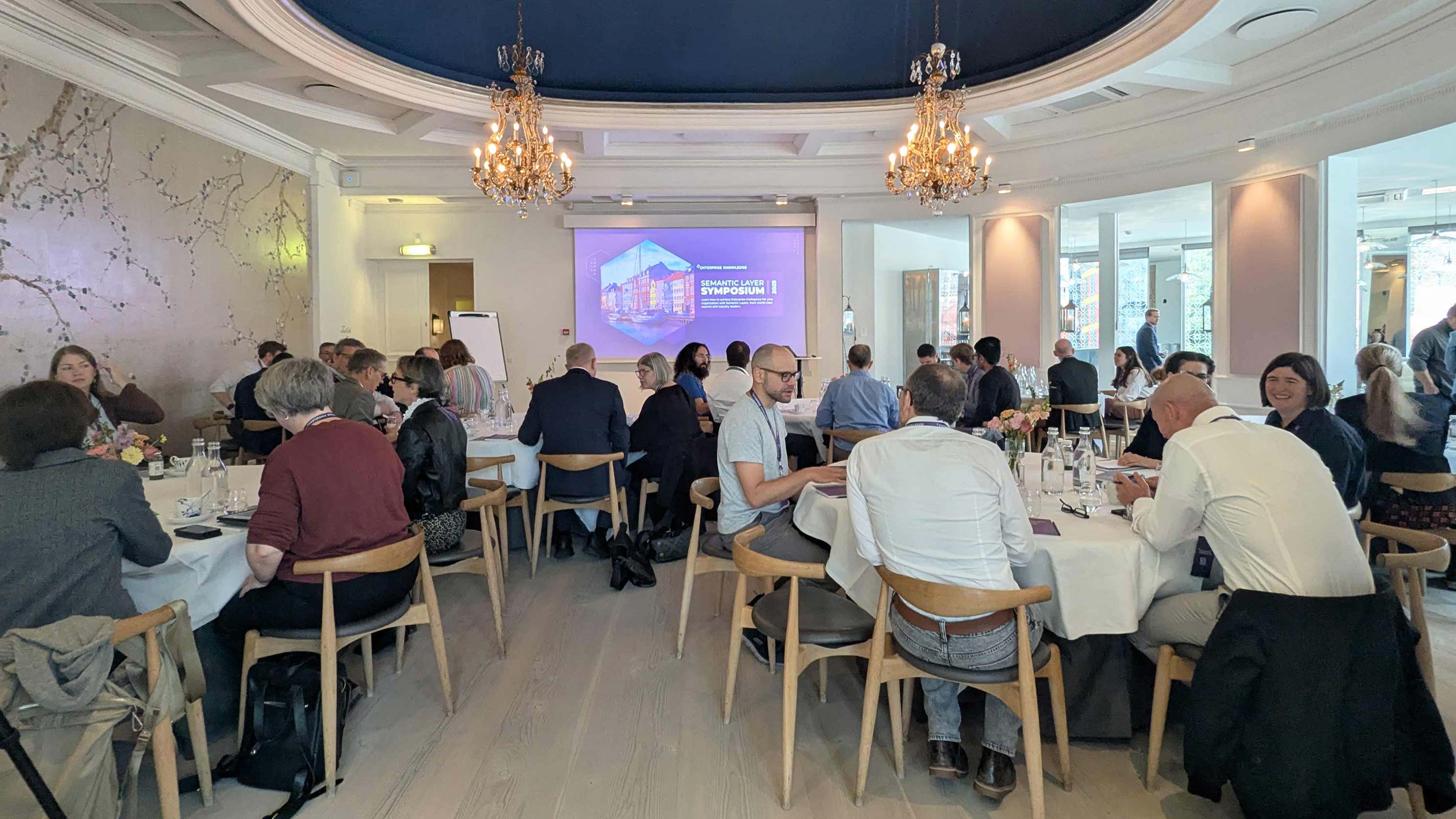
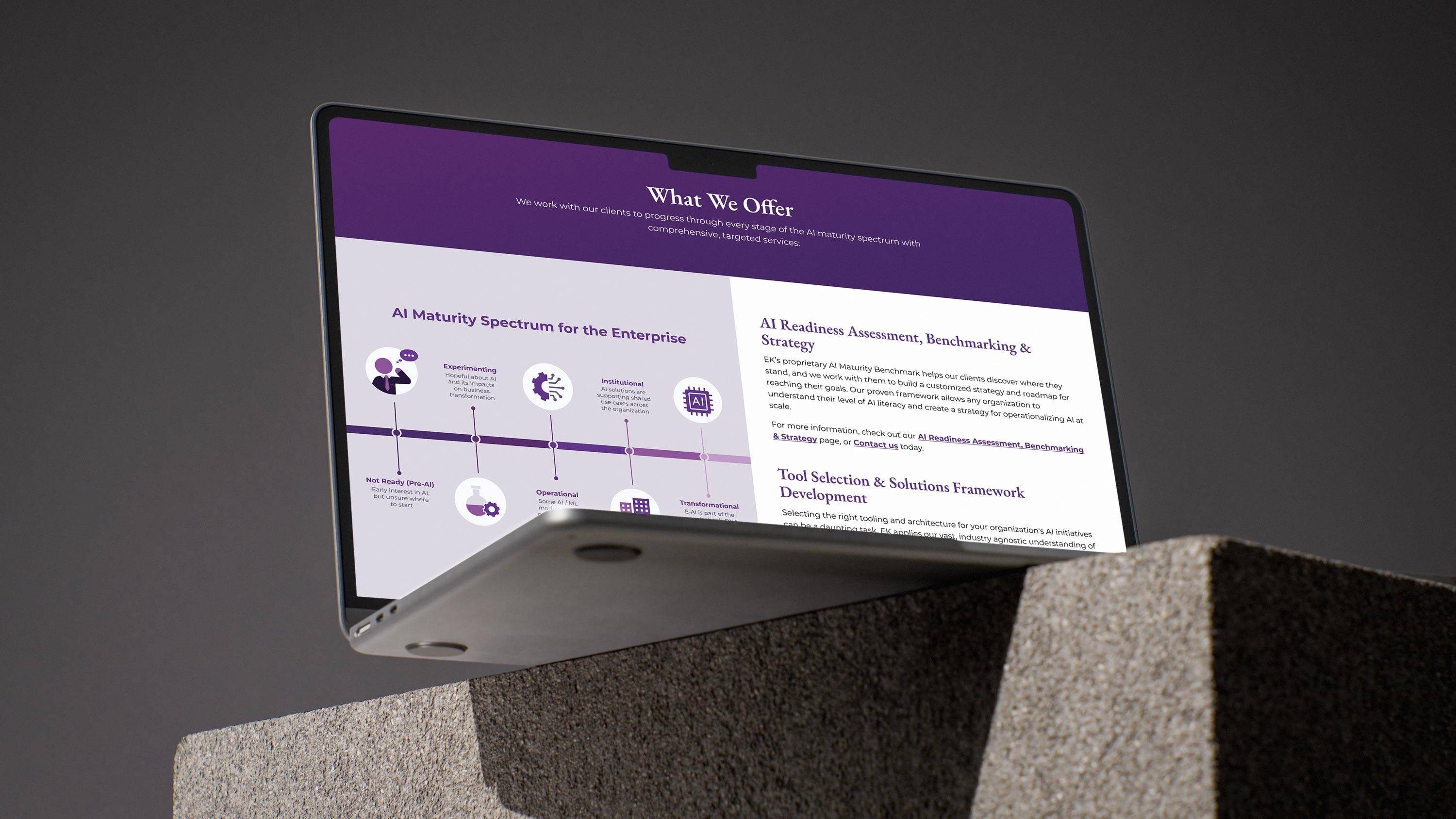
We further tested the brand system by expanding it across the main website and event collateral, such as the Semantic Layer Symposium. Beyond the icon suite, we incorporated similar geometric shapes as background overlays throughout marketing touchpoints. These choices allowed typography to lead and created a unified, highly recognizable visual language that branched out while staying tied to the core EK brand.
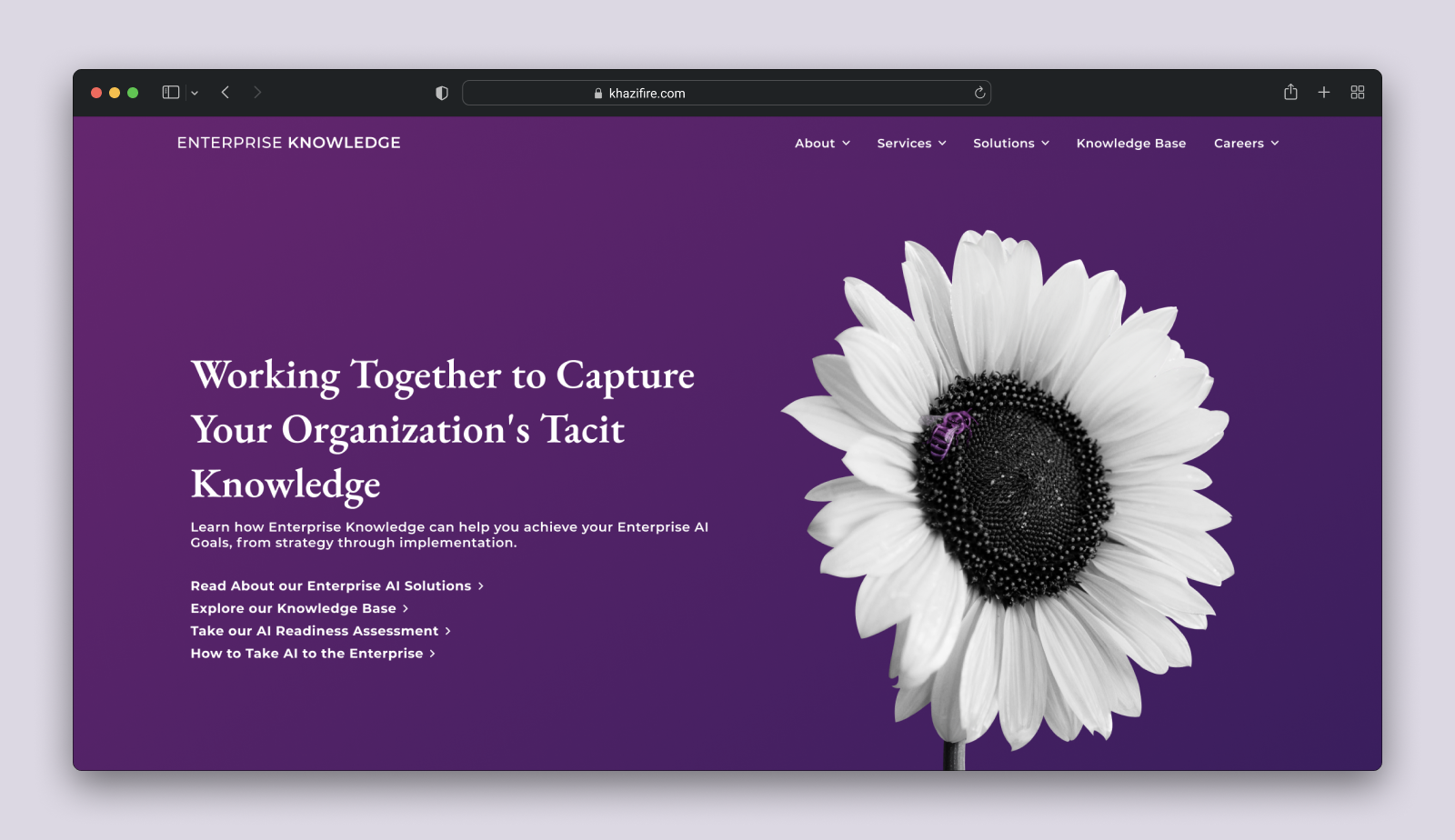
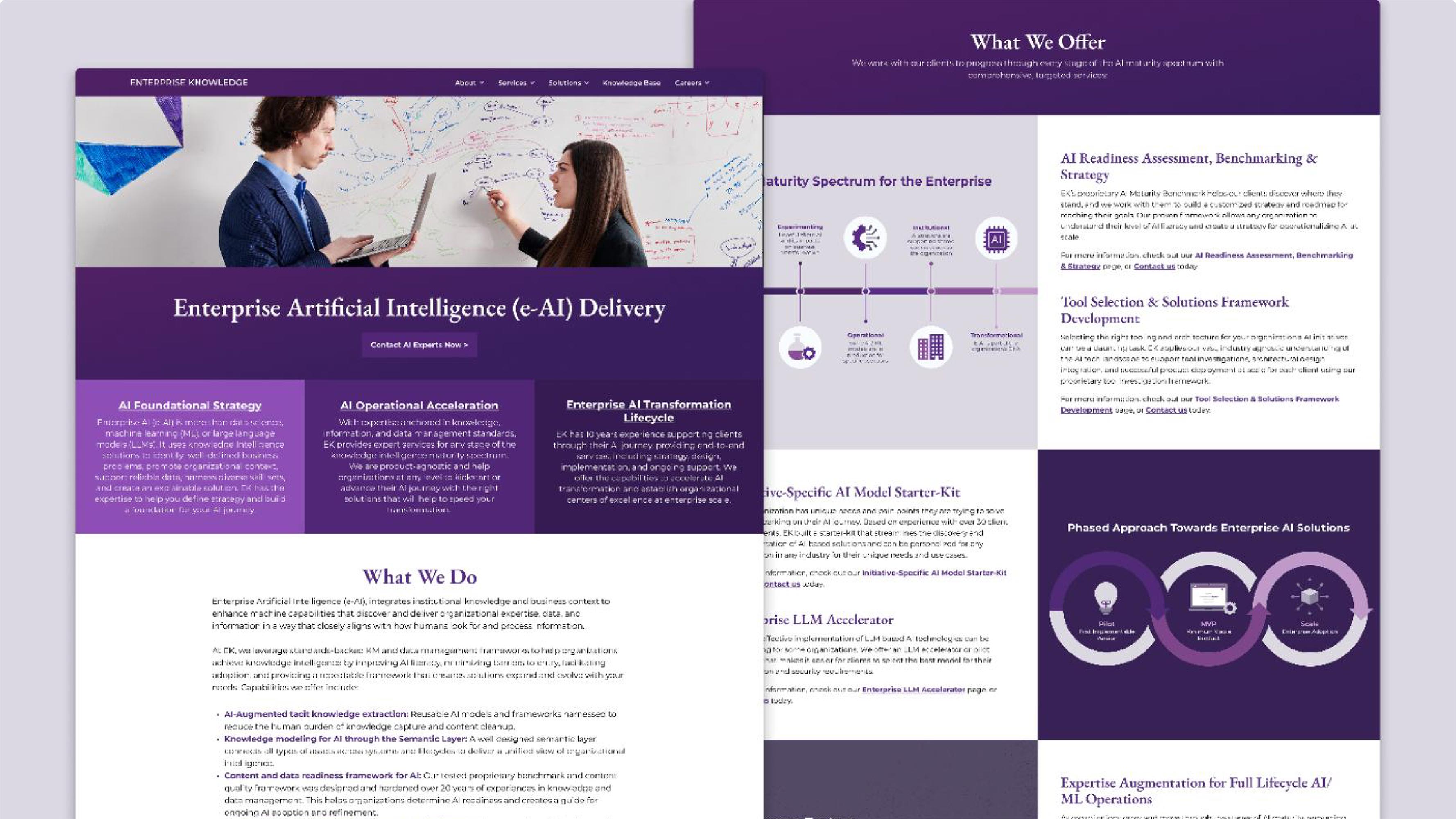
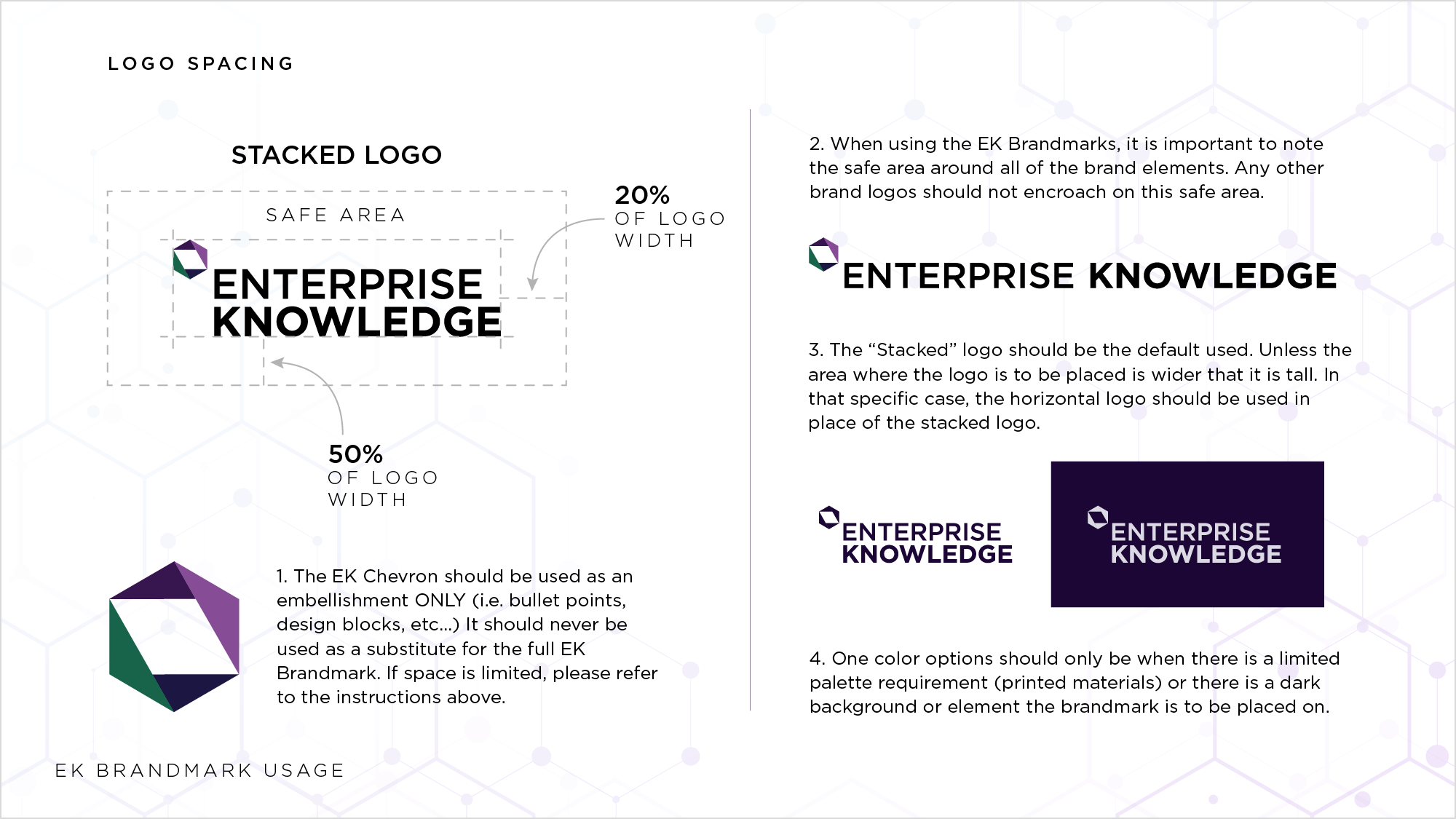
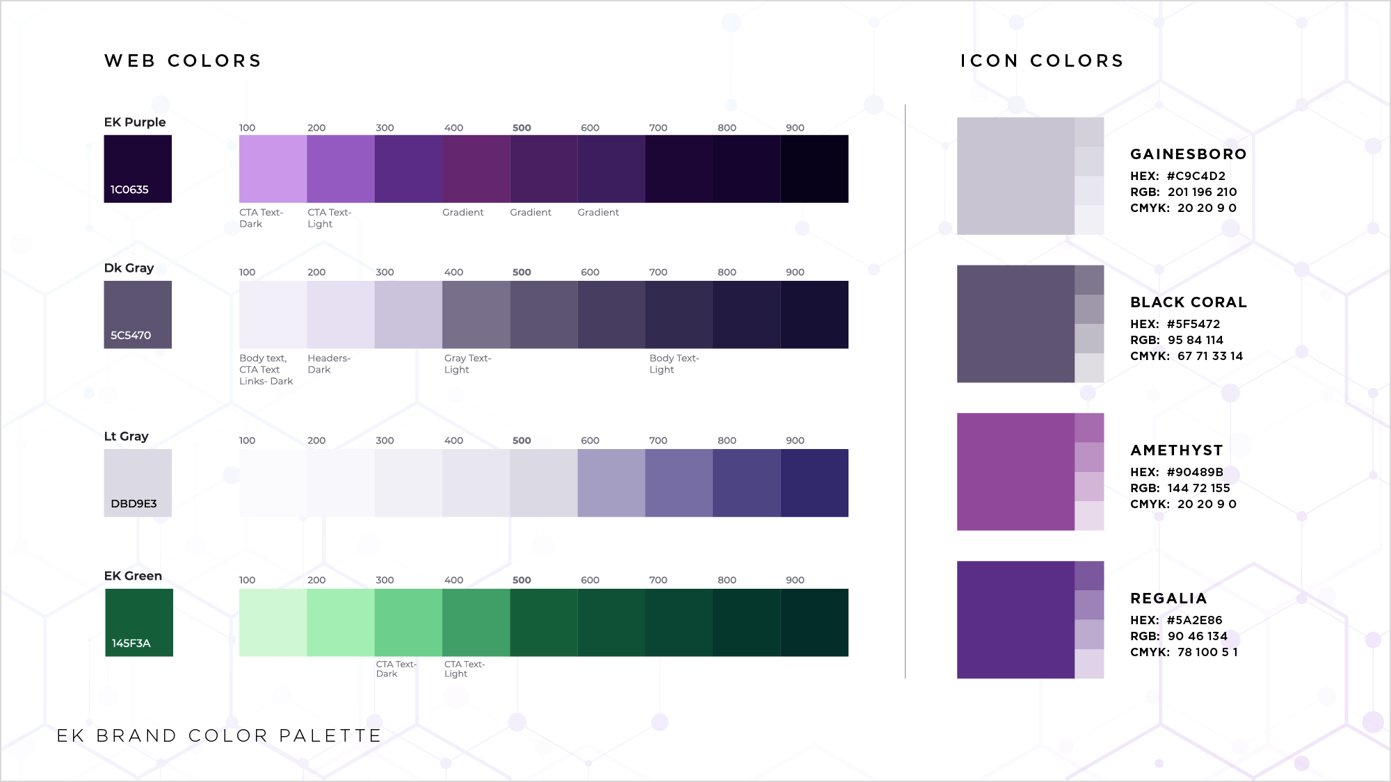
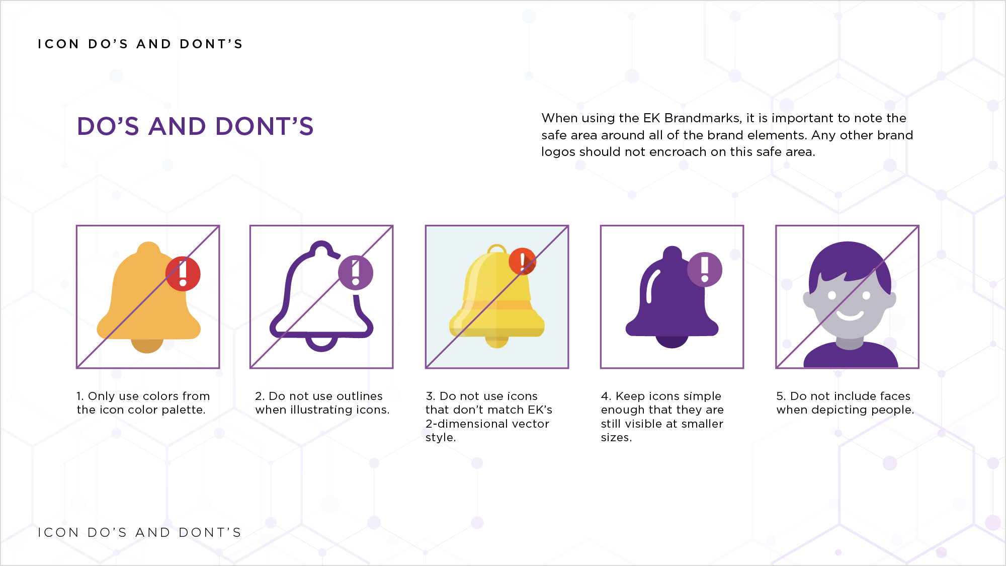
To ensure these systems lasted long after my involvement, I expanded EK’s existing brand guidelines to include the new visual identity. This toolkit detailed the illustration style and colors necessary to create new assets. By documenting the "how" and "why" behind the design, I provided the firm with a scalable resource that empowered internal consulting teams and future designers to evolve the brand without sacrificing visual governance.
While generic design resources provide a quick fix, they ultimately limit brand distinction. Through this partnership with Enterprise Knowledge, I developed a custom visual style and asset library tailored to their brand. Functioning as a scalable 'source of truth,' this design system empowers future teams to maintain, evolve, and reflect the firm's forward-thinking services.
If you saw something that piqued your interest, and have a project in mind, I would love to hear from you! I am always excited to discuss new opportunities. Fill out the form below to get the conversation started.

