
Many businesses struggle to convert website visitors into subscribers while also keeping their existing audience engaged. At What If, I helped clients overcome this challenge through strategic landing page redesigns. This case study examines a specific project for Debt Help, outlining the initial problems, my design solutions, and the positive impact on sign-ups and subscriber retention.
UX/UI Designer
Figma
Adobe Photoshop
Wireframes
Mockups
Prototypes
Outdated landing pages were a significant obstacle for What If's clients. The designs failed to meet the needs of modern users, resulting in poor engagement and low conversions. To understand the root of the problem, we needed to delve into user needs.
To establish a user-centered strategy, I collaborated with stakeholders to analyze existing designs and benchmark competitors. Analyzing subscriber data allowed me to build detailed user personas, ensuring our design direction directly solved key target audience pain points.
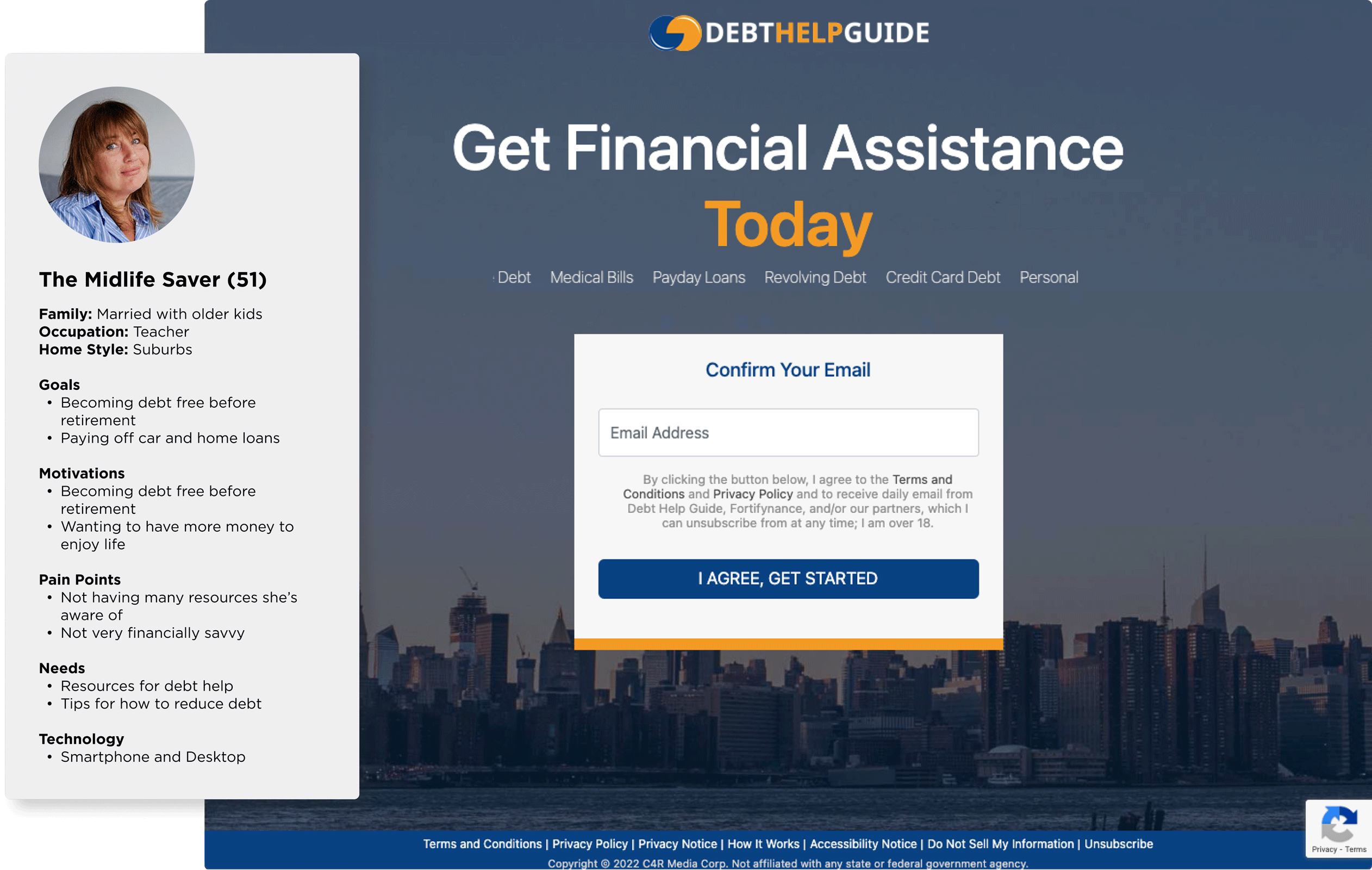
Persona and screenshot of original site
Their goal for the project was to modernize landing page designs, expand their reach, and significantly increase sign-ups.
Based on our data users were most attracted to content related to assistance with debt management, actionable tips for reducing debt, and access to relevant resources.
Leveraging user feedback and competitive research, I identified key content opportunities to guide our ideation. I adopted a mobile-first wireframing approach to address growing mobile traffic, while early collaboration with developers ensured our landing page layouts were technically viable and optimized for small-screen performance.

Competitor Research
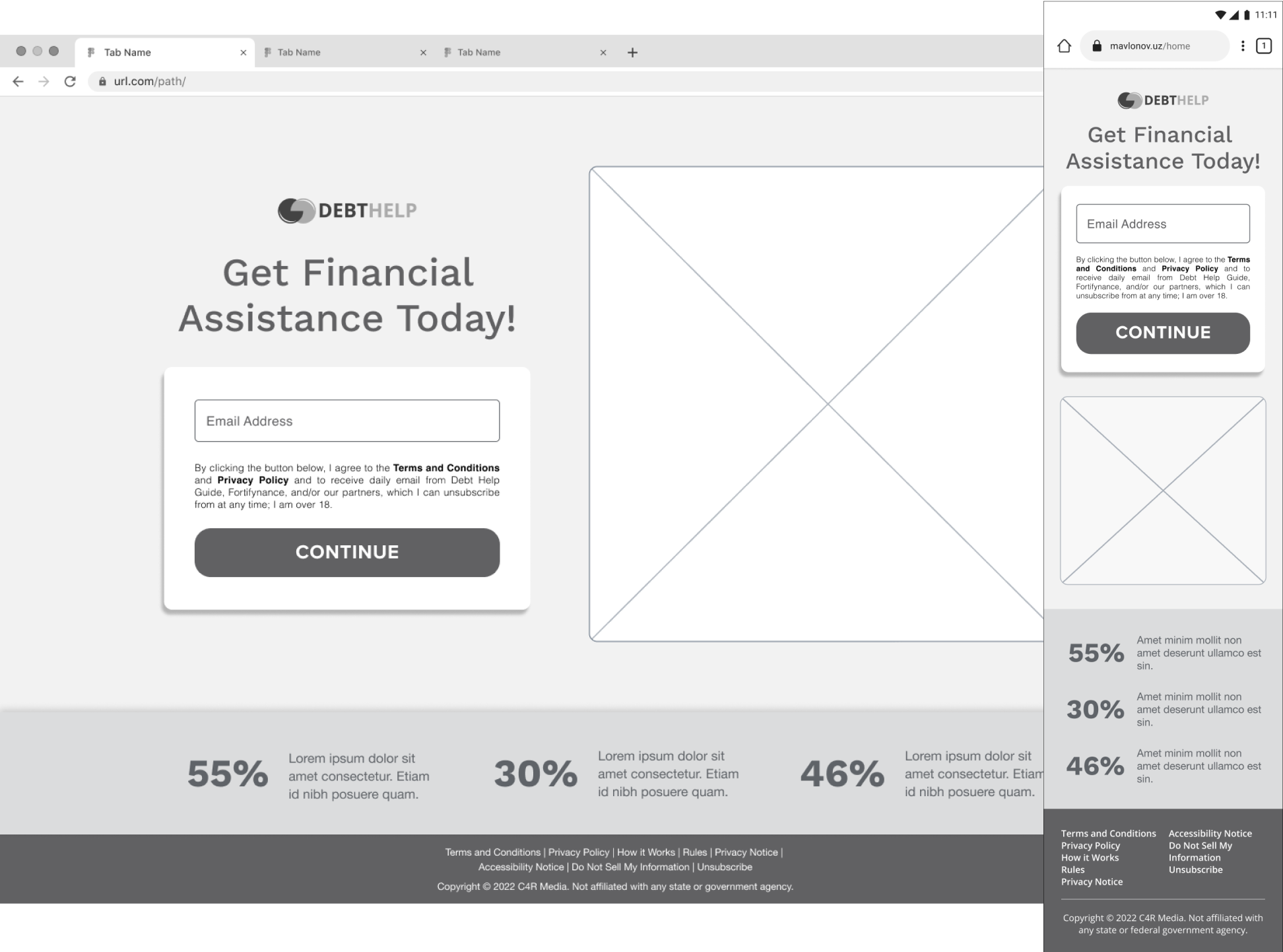
Mobile and Desktop Wireframes
To streamline development, I built high-fidelity prototypes that reflected the ideal final experience. This allowed engineering to proactively catch and resolve technical constraints early. I also incorporated micro-animations to enhance interactivity, balancing engagement with technical feasibility.

Desktop Prototype
We A/B tested the redesigned landing page against the original, incorporating user feedback throughout the process. This iterative approach resulted in a 5% increase in sign-ups. Key optimizations included the implementation of dark mode and the addition of consumer debt statistics.

Prototype Dark Version
By prioritizing user needs and leveraging data-driven insights, this project delivered a more valuable experience for Debt Help users. The 5% increase in sign-ups demonstrates the positive impact of this user-centered approach, highlighting the importance of ongoing testing and optimization to ensure continued user satisfaction and business success.

Mobile Mockup
If you saw something that piqued your interest, and have a project in mind, I would love to hear from you! I am always excited to discuss new opportunities. Fill out the form below to get the conversation started.

